Performance Pattern
Async Components
When developing large web applications, performance is paramount. The speed with which a page loads and the responsiveness of its interactive elements can greatly impact user experience. As web applications grow in size and complexity, it can become important to ensure that large bundles of code are loaded only when needed. Enter asynchronous components in Vue.
From our earlier article, we’ve come to understand that components are the fundamental building blocks for constructing the UI. Typically, when we use components, they’re automatically loaded and parsed, even if they aren’t immediately needed.
Asynchronous components, on the other hand, allow us to define components in a way that they’re loaded and parsed only when they’re required or when certain conditions are met. Let’s go through an exercise to better understand this.
Assume we had a simple modal component that becomes rendered when a button is clicked from the parent. The Modal.vue component file will only contain
template and styles that dictate how the modal appears.
<template>
  <div class="modal-mask">
    <div class="modal-container">
      <div class="modal-body">
        <h3>This is the modal!</h3>
      </div>

      <div class="modal-footer">
        <button class="modal-default-button" @click="$emit('close')">OK</button>
      </div>
    </div>
  </div>
</template>

<style>
  .modal-mask {
    position: fixed;
    z-index: 9998;
    top: 0;
    left: 0;
    width: 100%;
    height: 100%;
    background-color: rgba(0, 0, 0, 0.5);
    display: flex;
    transition: opacity 0.3s ease;
  }

  .modal-container {
    width: 300px;
    margin: auto;
    padding: 20px 30px;
    background-color: #fff;
    border-radius: 2px;
    box-shadow: 0 2px 8px rgba(0, 0, 0, 0.33);
    transition: all 0.3s ease;
  }

  .modal-body h3 {
    margin-top: 0;
    color: #42b983;
  }

  .modal-default-button {
    float: right;
  }
</style>
In the parent App component, we can render the modal component and a button that when clicked toggles the visibility of the modal component with
the help of a reactive boolean value (showModal). The modal is conditionally shown or hidden based on the value of the showModal reactive property.
<template>
  <button id="show-modal" @click="showModal = true">Show Modal</button>
  <Modal v-if="showModal" :show="showModal" @close="showModal = false" />
</template>

<script setup>
  import { ref } from "vue";
  import Modal from "./components/Modal.vue";

  const showModal = ref(false);
</script>
When we click the Show Modal button, the modal is shown on the page.
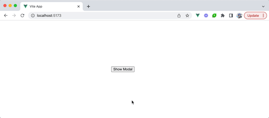
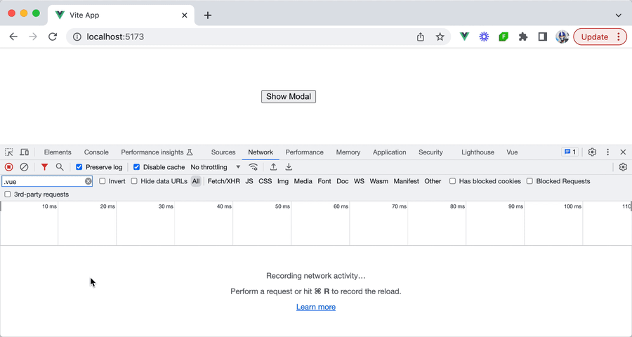
From this example, we can see that the modal component is shown only under a specific circumstance — when the user clicks the Show Modal button. Despite this,
the JavaScript bundle associated with the component is loaded automatically when the entire webpage is loaded even before the modal is made visible.
This can be seen from our browser’s network logs.
This is fine for the majority of cases. However, under conditions where the bundle size of the modal is really large and/or the application has a multitude of such components, this can lead to a delayed initial load time. With every added bundle, even if it’s related to components that are rarely used, the time it takes for the initial page to load grows.
defineAsyncComponent
This is where Vue allows us to divide an app into smaller chunks by loading components asynchronously with the help of the defineAsyncComponent()
function.
import { defineAsyncComponent } from "vue";

const AsyncComp = defineAsyncComponent(() => {
  return new Promise((resolve, reject) => {
    // ...load component from the server
    resolve(/* loaded component */);
  });
});
The defineAsyncComponent() function accepts a loader function that returns a Promise that resolves to the imported component. The Promise’s
resolve callback is to be called when the component has been successfully loaded, while the reject callback is invoked if there are any
errors during the loading process.
However, instead of defining our async component function like the above, we can leverage dynamic imports
to load an ECMAScript module (i.e. in our case, a component) asynchronously. This is achieved with the import() syntax.
import { defineAsyncComponent } from "vue";

export const AsyncComp = defineAsyncComponent(() =>
  import("./components/MyComponent.vue")
);
Let’s see this in action for our modal example. We’ll create a new file titled AsyncModal.js and in the file, we’ll import the defineAsyncComponent() function from the vue library and
assign an AsyncModal constant to the defineAsyncComponent() function call.
import { defineAsyncComponent } from "vue";

export const AsyncModal = defineAsyncComponent();
In our defineAsyncComponent() function call, we’ll use the import() syntax to asynchronously import the Modal component we created earlier.
import { defineAsyncComponent } from "vue";

export const AsyncModal = defineAsyncComponent(() => import("./Modal.vue"));
In our parent App component, we’ll now import and use the AsyncModal asynchronous component in place of the Modal component.
<template>
  <button id="show-modal" @click="showModal = true">Show Modal</button>
  <AsyncModal v-if="showModal" :show="showModal" @close="showModal = false" />
</template>

<script setup>
  import { ref } from "vue";
  import { AsyncModal } from "./components/AsyncModal";

  const showModal = ref(false);
</script>
With this small change, our modal component will now be asynchronously loaded! When our application webpage initially loads, we’ll recognize that
the bundle for the Modal component is no longer loaded automatically upon page load.
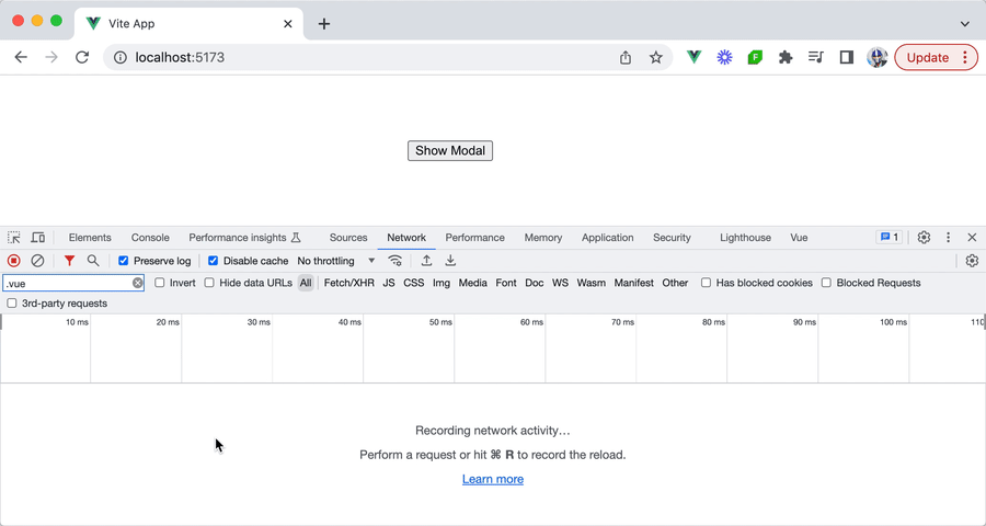
When we click the button to trigger the modal to be shown, we’ll notice the bundle is then asynchronously loaded as the modal component is being rendered.

Loading and error UI
With defineAsyncComponent(), Vue provides developers with more than just a means of asynchronously loading components. It also offers
capabilities to display feedback to users during the loading process and handle any potential errors. This ensures a smooth user experience
even when network conditions are less than ideal and/or if any errors occur during the asynchronous loading process.
loadingComponent
There may be times we may want to provide visual feedback to users while a component is being fetched, especially if the loading time is
significant. To achieve this, defineAsyncComponent() has a loadingComponent option that lets us specify a component to show during the
loading phase.
Since we’ll be declaring additional options in our defineAsyncComponent() function, we’ll use the loader() function option to
asynchronously import the modal component.
import { defineAsyncComponent } from "vue";

export const AsyncModal = defineAsyncComponent({
  loader: () => import("./Modal.vue"),
});
Assume we have a simple loading component template defined in a Loading.vue component file as follows:
<template>
  <p>Loading...</p>
</template>
We can then specify this loading component as the value of our loadingComponent option in our defineAsyncComponent() function.
import { defineAsyncComponent } from "vue";
import Loading from "./Loading.vue";

export const AsyncModal = defineAsyncComponent({
  loader: () => import("./Modal.vue"),
  loadingComponent: Loading,
});
As the modal component becomes asynchronously loaded, the user will now be presented with a Loading... message. This may be hard to see in
fast internet connections, so we’ll emulate a Slow 3G network in our browser network logs to observe the behavior of seeing the Loading...
message while the modal component bundle is still being loaded.

errorComponent
In certain conditions (e.g. poor internet connections), there may be chances that the asynchronous component fails to load. For these
scenarios, providing feedback about the error is important for a good user experience. The defineAsyncComponent() function offers the
errorComponent option to handle such situations, allowing us to specify a component to be displayed when there’s a loading error.
Assume we have an error component template defined in an Error.vue component file like this:
<template>
  <p>Error!</p>
</template>
To integrate this component into our async modal setup, we can specify it as the value of our errorComponent option.
import { defineAsyncComponent } from "vue";
import Loading from "./Loading.vue";
import Error from "./Error.vue";
export const AsyncModal = defineAsyncComponent({
loader: () => import("./Modal.vue"),
loadingComponent: Loading,
errorComponent: Error,
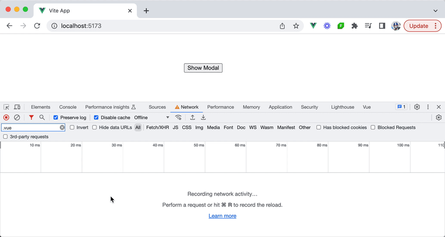
});To visualize this in action, we can simulate the Offline network mode in our browser devtools and attempt to launch the modal. We’ll notice
that when the modal component fails to load, the Error component template will be shown.
With all the changes we’ve made, our app can be seen as below.
1import { defineAsyncComponent } from "vue";2 import Loading from "./Loading.vue";3 import Error from "./Error.vue";45 export const AsyncModal = defineAsyncComponent({6 loader: () => import("./Modal.vue"),7 loadingComponent: Loading,8 errorComponent: Error9 });
The defineAsyncComponent() function accepts further options like delay, timeout, suspensible, and onError() which provide developers
with more granular control over the asynchronous loading behavior and user experience. Be sure to check out the API documentation for more
details on these properties.
The defineAsyncComponent() function can help in breaking down the initial load of a Vue application into manageable chunks by
deferring the loading of certain components until they’re needed. This can help improve page load times and overall application
performance especially when an application has numerous components that have a large bundle size.