Design Pattern
Components
Vue components are the building blocks of Vue apps by allowing us to couple markup (HTML), logic (JS), and styles (CSS) within them.
When working within a Vue application, it’s important to understand that almost every element displayed in the UI is oftentimes part of a Vue component. This is because a Vue application is often composed of components nested within components, forming a hierarchical structure.
Reusability and maintainability are some of the main reasons why building an application with well-structured components are especially important.
To get a better understanding of components, we’ll go ahead and create one. The simplest way to create a Vue component in an application that doesn’t contain a build process (e.g. Webpack) is to create a plain JavaScript object that contains Vue specific options.
export default {
  props: ["name"],
  template: `<h1>Hello, my name is {{ name }}</h1>`,
};
The component has a props property defined, which accepts a single prop named name. Props are a way to pass data into a
component from its parent component.
The template property defines the HTML template for the component. In this case, it contains an <h1> heading tag that
displays the text "Hello, my name is" followed by the value of the name prop, which is rendered using Vue’s double curly
braces syntax {{ }}.
Aside from defining components as plain JavaScript objects, the most common way of creating components in Vue are with single-file
components (SFCs). Single-file components are components that allow us to define the HTML, CSS, and JS of a component all
within a special .vue file, as shown below:
<template>
  <h1>Hello, my name is {{ name }}</h1>
</template>

<script setup>
  const { name } = defineProps(["name"]);
</script>
Note: Single-file components in Vue are made possible due to build tools like Vite. These tools help compile
.vuecomponents to plain JavaScript modules that can be understood in browsers.
Components = building blocks
We’ll go through a simple exercise to illustrate how components can be split into smaller components. Consider the following
fictional Tweet component:
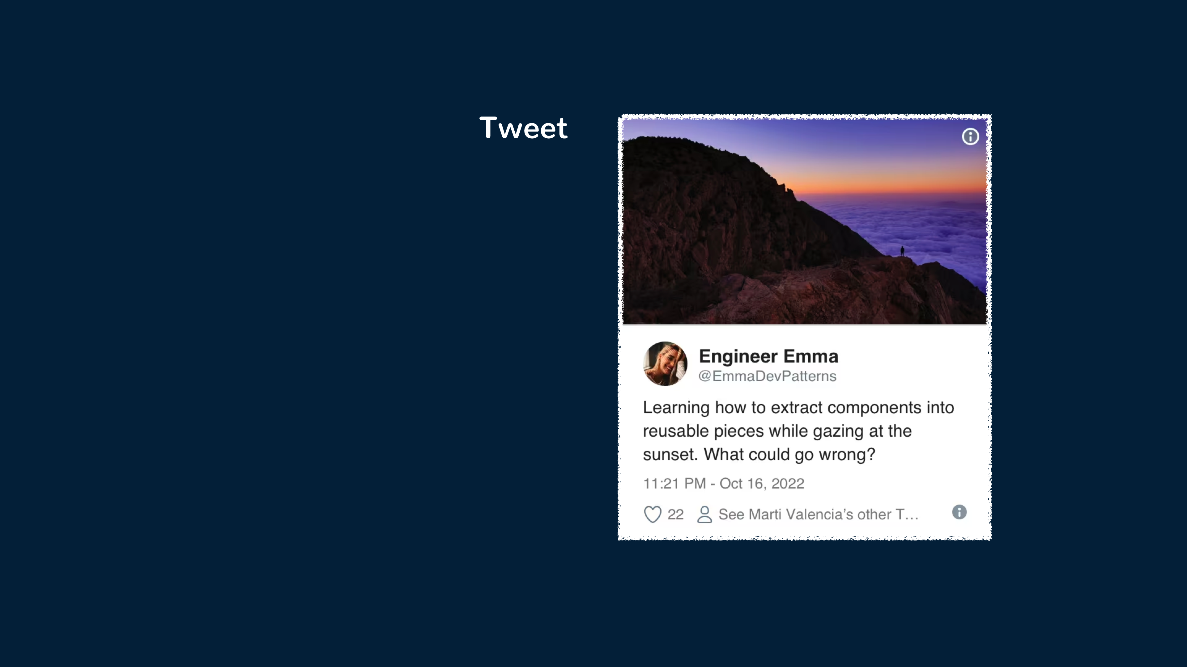
The above component can be implemented with something as follows:
<template>
  <div class="Tweet">
    <image class="Tweet-image" :src="image.imageUrl" :alt="image.description" />
    <div class="User">
      <image class="Avatar" :src="author.avatarUrl" :alt="author.name" />
      <div class="User-name">{{ author.name }}</div>
    </div>
    <div class="Details">
      <div class="Tweet-text">{{ text }}</div>
      <div class="Tweet-date">{{ formatDate(date) }}</div>
      <!-- ... -->
    </div>
  </div>
</template>

<script setup>
  // ...
</script>
One can look at the above component and consider it difficult to manipulate because of how clustered it is, and reusing individual parts of it may also prove difficult. To make things more composable, we can extract a few components from this one component.
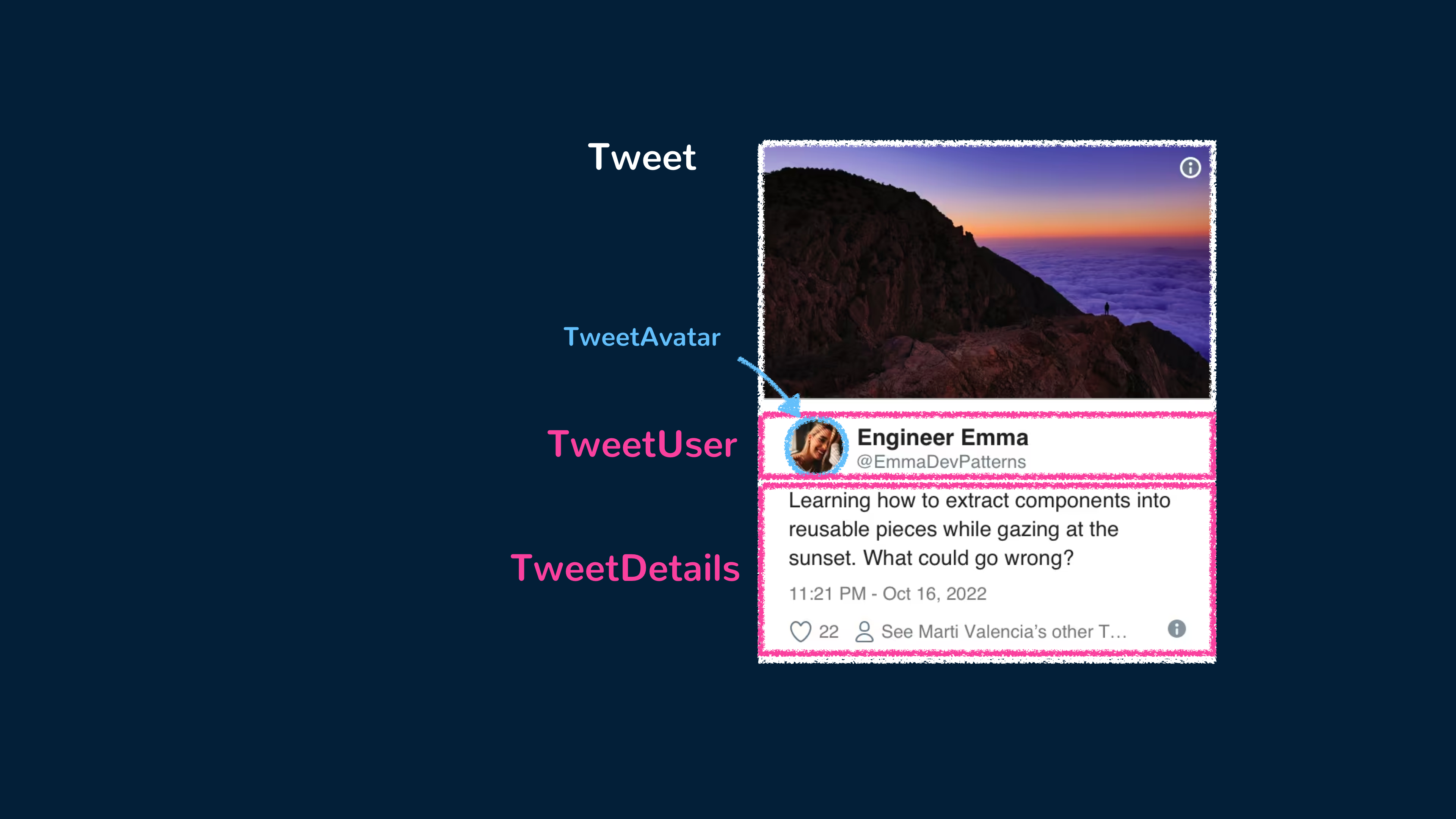
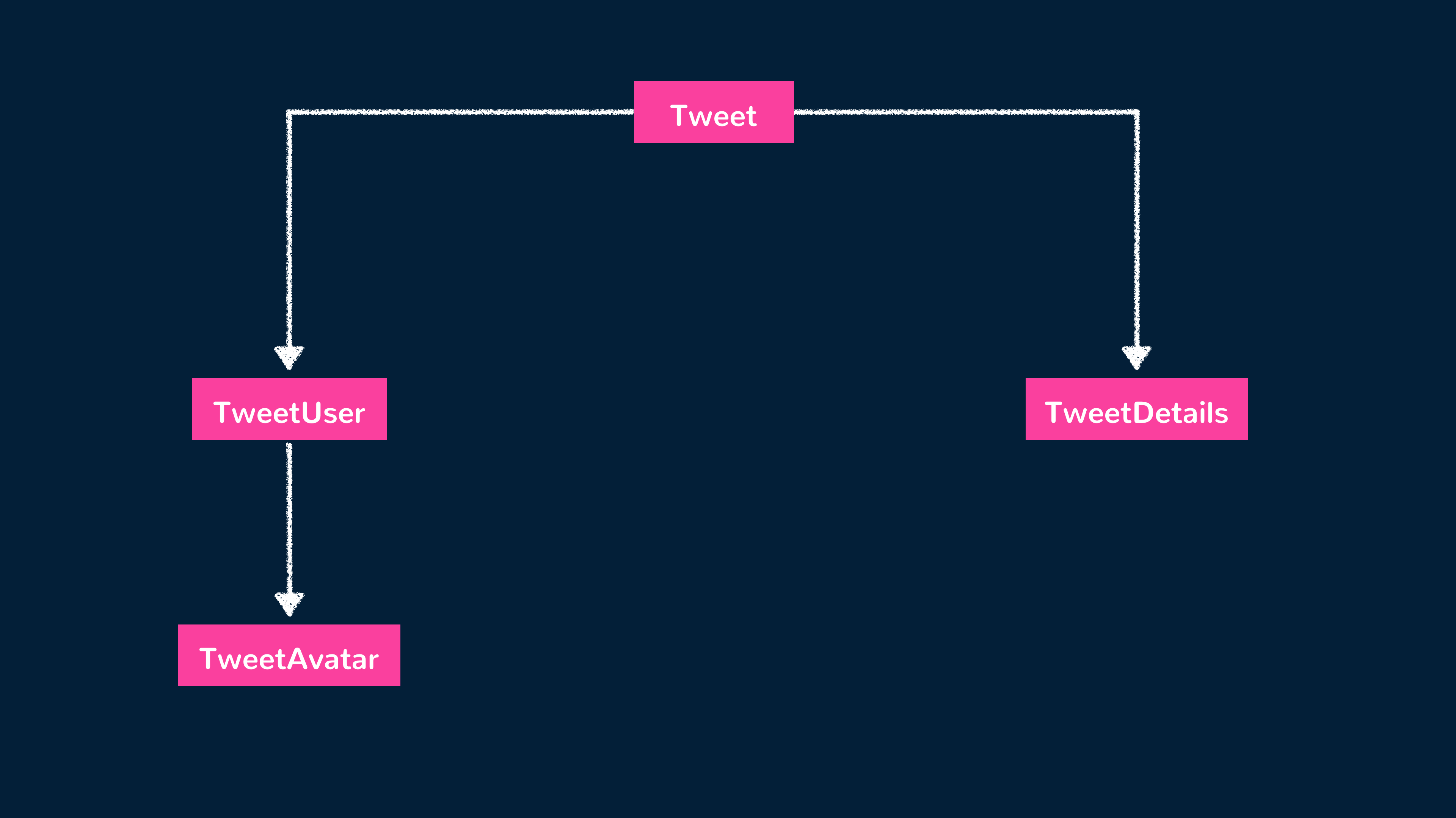
We can have the main Tweet component be the parent to the TweetUser and TweetDetails components. TweetUser will display the user’s information
and be a parent to a TweetAvatar component that displays the user’s avatar. TweetDetails will simply display additional information in the
tweet such as the tweet text and the date of submission. The component tree will look like the following:
We can first create the child TweetAvatar component to contain the avatar image element.
<template>
  <image class="Avatar" :src="author.avatarUrl" :alt="author.name" />
</template>

<script setup>
  // ...
</script>
We can then create the TweetUser component that renders the TweetAvatar component and relevant user information.
<template>
  <div class="User">
    <TweetAvatar />
    <div class="User-name">{{ author.name }}</div>
  </div>
</template>

<script setup>
  import { TweetAvatar } from "./TweetAvatar.vue";
</script>
We can create the TweetDetails component to render the remaining information in the tweet.
<template>
  <div class="Details">
    <div class="Tweet-text">{{ text }}</div>
    <div class="Tweet-date">{{ formatDate(date) }}</div>
    <!-- ... -->
  </div>
</template>

<script setup>
  // ...
</script>
Finally, we can use these newly created child components to simplify the template of the parent Tweet component.
<template>
  <div class="Tweet">
    <image class="Tweet-image" :src="image.imageUrl" :alt="image.description" />
    <TweetUser :author="author" />
    <TweetDetails :text="text" :date="date" />
  </div>
</template>

<script setup>
  // ...
</script>
Extracting components seems like a tedious job, but having reusable components makes things easier when coding for larger apps. A good criterion
to consider when simplifying components is this — if a part of your UI is used several times (Button, Panel, Avatar), or is complex enough
on its own (App, FeedStory, Comment), it is a good candidate to be extracted into a separate component.
Reactive state
Reactive state is a fundamental concept in Vue components that enables dynamic and responsive user interfaces. It allows components to update and reflect changes in their data automatically.
In Vue, we can define reactive data properties with the ref() function (for standalone primitive values) and the reactive() function (for objects).
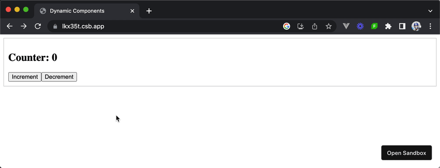
Let’s consider a simple example of a counter component:
<template>
  <div>
    <h2>Counter: {{ count }}</h2>
    <button @click="increment">Increment</button>
    <button @click="decrement">Decrement</button>
  </div>
</template>

<script setup>
  import { ref } from "vue";

  const count = ref(0);

  const increment = () => {
    count.value++;
  };

  const decrement = () => {
    count.value--;
  };
</script>
In the above example, we define a reactive property count and initialize it with a value of 0. The template then uses double curly braces
{{ }} to display the current value of count.
The template also includes two buttons: "Increment" and "Decrement", which are bound to the corresponding increment() and decrement()
methods using the @click directive. Inside these methods, we access and modify the value of the reactive count property. Vue detects the
changes and automatically updates the component’s rendering to reflect the new value.
Reactive state in Vue components provides a seamless way to manage and track data changes, making it easier to build interactive and dynamic user interfaces.
1<template>2 <div class="demo tab">3 <h2>Counter: {{ count }}</h2>4 <button @click="increment">Increment</button>5 <button @click="decrement">Decrement</button>6 </div>7</template>89<script setup>10import { ref } from "vue";1112const count = ref(0);1314const increment = () => {15 count.value++;16};1718const decrement = () => {19 count.value--;20};21</script>
Conclusion
This article aims to be a simple introduction to the concept of components. In the other articles and guides, we’ll be taking a deeper dive into understanding common and important patterns when working with Vue and Vue components. This includes but is not limited to:
- Using the
<script setup>syntax - Creating composables to reuse stateful logic
- Passing data down multiple components with provide/inject
- Understanding application-wide state management
- Using dynamic components to dynamically switch between components
- Rendering component templates with JSX
- and a lot more.