Rendering Pattern
Renderless components
Renderless components are a pattern in Vue that separates the logic of a component from its presentation. The pattern provides a way to encapsulate functionality without dictating the visual representation of the component. In other words, a renderless component focuses solely on the logic and behavior, while leaving the rendering to the parent component.
Renderless components are particularly useful when we need to create reusable logic that can be applied to different UI implementations. By abstracting the logic into a renderless component, we can easily reuse it in various contexts without duplicating code. If you’re still confused at this moment, don’t worry! Let’s dive deeper into this concept with an example.
Toggle, toggle, toggle
Imagine you have a toggle UI element that needs to be used in different parts of your application, but each instance may have a different visual representation. Some toggles might be displayed as buttons, while others might be checkboxes or switches.
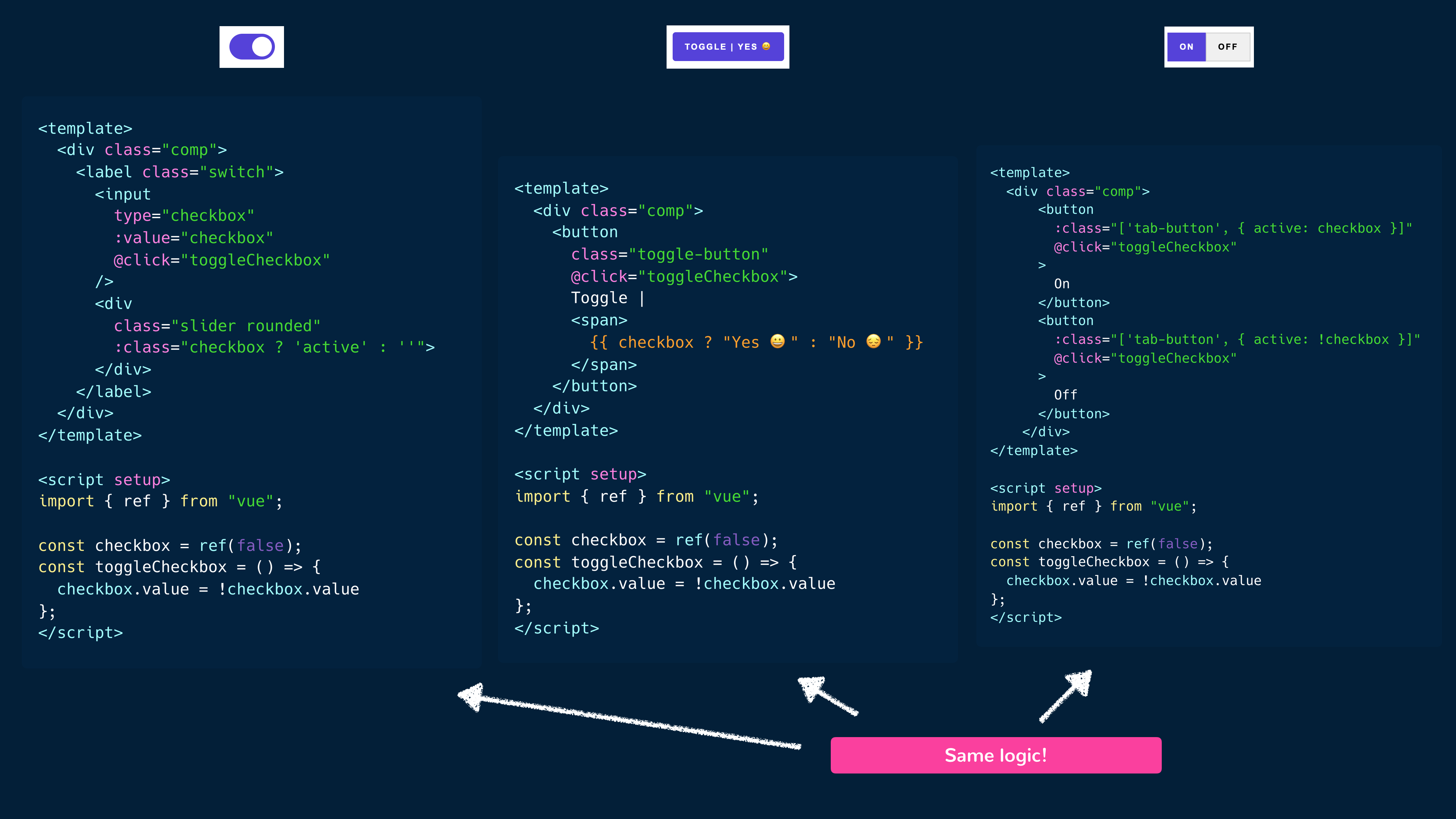
We could just create three different toggle components for the example above, however, we can observe that each toggle element has the same logic
and behavior. Each toggle has an inactive and active state that’s being tracked with a component data property (e.g. checked). When a
toggle is clicked, its component state is switched from inactive to active and vice versa (i.e. checked = !checked).
Here’s a visual that displays how each component’s <template> and <script> sections are constructed:
Right away, we can see that we can create a more reusable pattern by extracting the common logic and behavior in such a way that we don’t have to repeatedly define the state and toggle methods in each individual toggle component. This is a great case to use composables since composables will allow us to encapsulate and share the common stateful logic across the different toggle components.
useCheckboxToggle:
import { ref } from "vue";

export function useCheckboxToggle() {
  const checkbox = ref(false);

  const toggleCheckbox = () => {
    checkbox.value = !checkbox.value;
  };

  return {
    checkbox,
    toggleCheckbox,
  };
}
A toggle component:
<template>
  <div class="comp">
    <label class="switch">
      <input type="checkbox" :value="checkbox" @click="toggleCheckbox" />
      <div class="slider rounded" :class="checkbox ? 'active' : ''"></div>
    </label>
  </div>
</template>

<script setup>
  import { useCheckboxToggle } from "./composables/useCheckboxToggle";

  const { checkbox, toggleCheckbox } = useCheckboxToggle();
</script>
Though the above works very well for our use case, Vue gives us another pattern on how we can reuse stateful logic while keeping it decoupled from rendering.
Renderless components
The main idea behind renderless components is to create a component that doesn’t render any HTML or UI elements itself but exposes its internal state and methods to its parent component. The parent component then takes care of rendering the appropriate UI based on the exposed data and behavior of the renderless component.
The ability to have the parent component dictate what should be rendered is made possible with the concept known as slots.
Slots allow the parent component to inject template content into a child component and can be considered to be like props but instead of passing down JavaScript values, they allow the passing of template fragments down to children components.
Let’s begin creating our renderless toggle component. In the <script> section of the component, we’ll have the stateful logic responsible in toggling
a checkbox state value.
<script setup>
  import { ref } from "vue";

  const checkbox = ref(false);

  const toggleCheckbox = () => {
    checkbox.value = !checkbox.value;
  };
</script>
In the <template> section of the component, we’ll use the special <slot> element to dictate that this is where the parent-provided template
content will be.
<template>
  <slot></slot>
</template>

<script setup>
  import { ref } from "vue";

  const checkbox = ref(false);

  const toggleCheckbox = () => {
    checkbox.value = !checkbox.value;
  };
</script>
We’ll need the checkbox and toggleCheckbox() properties available in the parent when we declare the template we want to be rendered in the
child. To do this, we can pass these properties to the <slot></slot> outlet like we pass down props to a component.
<template>
  <slot :checkbox="checkbox" :toggleCheckbox="toggleCheckbox"></slot>
</template>

<script setup>
  import { ref } from "vue";

  const checkbox = ref(false);

  const toggleCheckbox = () => {
    checkbox.value = !checkbox.value;
  };
</script>
In the parent component, we’ll now be able to reference the checkbox and toggleCheckbox() attributes as we dictate how we want
the child component to be rendered.
Notice how the component we’ve created has no template of its own? This is what makes it a renderless component, a component that focuses solely on logic and behavior, while leaving rendering to its parent.
In the parent component, we’ll now attempt to render three different toggle elements each with their own unique user experience. We’ll first import
the renderless ToggleComponent component we’ve created above.
<script setup>
  import ToggleComponent from "./components/ToggleComponent";
</script>
Now, we can attempt to render the <ToggleComponent> and whatever we place in the children of the component will be the template slot content
rendered.
<template>
  <ToggleComponent>
    <!-- slot content -->
    <!-- (i.e. what gets rendered as the ToggleComponent template) -->
  </ToggleComponent>
</template>

<script setup>
  import ToggleComponent from "./components/ToggleComponent";
</script>
As we render the component slot content, we’ll need access to the properties in the child component scope (checkbox and toggleCheckbox()).
Since we’ve passed these attributes to the slot outlet earlier (<slot :checkbox="checkbox" :toggleCheckbox="toggleCheckbox"></slot>), we
can use the v-slot directive to receive these slot props.
<template>
  <ToggleComponent v-slot="{ checkbox, toggleCheckbox }">
    <!-- slot content -->
    <!-- (i.e. what gets rendered as the ToggleComponent template) -->
  </ToggleComponent>
</template>

<script setup>
  import ToggleComponent from "./components/ToggleComponent";
</script>
With the relevant slot props available to us, we can now render the first toggle element. This toggle element will be a switch toggle
that goes from the inactive to active state depending on the value of the checkbox property.
<template>
<ToggleComponent v-slot="{ checkbox, toggleCheckbox }">
<div class="comp">
<label class="switch">
<input type="checkbox" :value="checkbox" @click="toggleCheckbox" />
<div class="slider rounded" :class="checkbox ? 'active' : ''"></div>
</label>
</div>
</ToggleComponent>
</template>
<script setup>
import ToggleComponent from "./components/ToggleComponent";
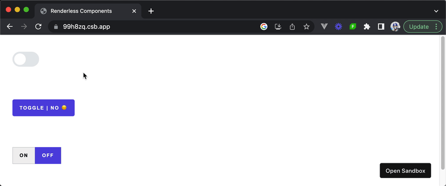
</script>When saving our changes, we’ll be presented with the switch toggle in our app.
We can go ahead and create the other two toggle elements in a very similar fashion. The second toggle element will be a button that when clicked,
toggles between the text of Toggle | Yes 😀 and Toggle | No 😔.
<template>
  <!-- Toggle element 1 -->
  <ToggleComponent v-slot="{ checkbox, toggleCheckbox }">
    <div class="comp">
      <label class="switch">
        <input type="checkbox" :value="checkbox" @click="toggleCheckbox" />
        <div class="slider rounded" :class="checkbox ? 'active' : ''"></div>
      </label>
    </div>
  </ToggleComponent>

  <!-- Toggle element 2 -->
  <ToggleComponent v-slot="{ checkbox, toggleCheckbox }">
    <div class="comp">
      <button class="toggle-button" @click="toggleCheckbox">
        Toggle | <span>{{ checkbox ? "Yes 😀" : "No 😔" }}</span>
      </button>
    </div>
  </ToggleComponent>
</template>

<script setup>
  import ToggleComponent from "./components/ToggleComponent";
</script>
Finally, our third toggle element will be two tabbed buttons that when either is clicked toggles the active state of both buttons.
<template>
  <!-- Toggle element 1 -->
  <ToggleComponent v-slot="{ checkbox, toggleCheckbox }">
    <div class="comp">
      <label class="switch">
        <input type="checkbox" :value="checkbox" @click="toggleCheckbox" />
        <div class="slider rounded" :class="checkbox ? 'active' : ''"></div>
      </label>
    </div>
  </ToggleComponent>

  <!-- Toggle element 2 -->
  <ToggleComponent v-slot="{ checkbox, toggleCheckbox }">
    <div class="comp">
      <button class="toggle-button" @click="toggleCheckbox">
        Toggle | <span>{{ checkbox ? "Yes 😀" : "No 😔" }}</span>
      </button>
    </div>
  </ToggleComponent>

  <!-- Toggle element 3 -->
  <ToggleComponent v-slot="{ checkbox, toggleCheckbox }">
    <div class="comp">
      <button
        :class="['tab-button', { active: checkbox }]"
        @click="toggleCheckbox"
      >
        On
      </button>
      <button
        :class="['tab-button', { active: !checkbox }]"
        @click="toggleCheckbox"
      >
        Off
      </button>
    </div>
  </ToggleComponent>
</template>

<script setup>
  import ToggleComponent from "./components/ToggleComponent";
</script>
With these changes saved, we’ll be presented with the three toggle elements that appear different but have the same underlying logic.
1<template>2 <slot :checkbox="checkbox" :toggleCheckbox="toggleCheckbox"></slot>3</template>45<script setup>6import { ref } from "vue";78const checkbox = ref(false);910/* eslint-disable-next-line no-unused-vars */11const toggleCheckbox = () => {12 checkbox.value = !checkbox.value;13};14</script>
Composables vs. renderless components
Composables and renderless components are two patterns in Vue that offer different approaches for encapsulating and reusing logic.
We’ve seen in our previous article that composables typically consist of functions that return reactive data and methods, which can be imported and used in different components. On the other hand, renderless components focus on separating the logic of a component from its presentation by having the parent component take care of rendering the appropriate UI based on the exposed data and behavior of the renderless component.
The Vue documentation recommends using composables whenever possible since the renderless component pattern can sometimes incur a performance overhead due to the number of additional component instances that are created. However, renderless components can sometimes be beneficial in situations where we need fine-grained control over the rendering and/or need to reuse both logic and visual layout.