Design Pattern
Composables
Options API
Before the introduction of the Composition API in Vue, developers relied on the Options API to organize component logic which include reactive data, lifecycle methods, computed properties, and more. The Options API allowed defining these aspects within specific options, as shown in the example below:
<!-- Template -->

<script>
  export default {
    name: "MyComponent",
    props: {
      // props
    },
    data() {
      // data
    },
    computed: {
      // computed properties
    },
    watch: {
      // properties to watch
    },
    methods: {
      // methods
    },
    created() {
      // lifecyle methods like created
    },
    // ...
  };
</script>

<!-- Styles -->
While this approach served its purpose and is still applicable in Vue v3, it can become challenging to manage and maintain as components grow larger and more complex. Defining component logic within specific options can make it harder to read and understand the code, especially when dealing with extensive components. Extracting and reusing common logic between components can also be difficult in this setup.
Let’s take a look at a simple example of an App component that renders two individual child components — Count and Width.
<template>
  <div class="App">
    <Count :count="count" :increment="increment" :decrement="decrement" />
    <div id="divider" />
    <Width :width="width" />
  </div>
</template>

<script>
  import Count from "./components/Count.vue";
  import Width from "./components/Width.vue";

  export default {
    name: "App",
    data() {
      return {
        count: 0,
        width: 0,
      };
    },
    mounted() {
      this.handleResize();
      window.addEventListener("resize", this.handleResize);
    },
    beforeUnmount() {
      window.removeEventListener("resize", this.handleResize);
    },
    methods: {
      increment() {
        this.count++;
      },
      decrement() {
        this.count--;
      },
      handleResize() {
        this.width = window.innerWidth;
      },
    },
    components: {
      Count,
      Width,
    },
  };
</script>
The code snippet above represents a Vue single-file component (SFC) named App.
The <template> section defines the markup of the component. In this case, it contains a <div> element with the class “App”
that wraps two child components: <Count> and <Width>. These child components are passed certain properties using Vue’s
attribute binding syntax (:count, :increment, :decrement, and :width).
The <script> section contains the JavaScript code for the component. It starts by importing the Count and Width components
from their respective files. The export default statement is used to export the component definition. Within the component
definition, we have:
- The
datamethod which returns an object containing the initial data properties of the component, which arecountandwidthinitialized to 0. - The
mounted()lifecycle hook is used to execute code after the component has been mounted in the DOM. In this case, it calls thehandleResize()method and adds an event listener for the resize event. - The
beforeUnmount()lifecycle hook is used to execute code before the component is unmounted and destroyed. Here, it removes the event listener for the resize event. - The
methodsobject contains the component’s methods. It definesincrement(),decrement(), andhandleResize()methods that manipulate the count and width data properties based on certain events or actions.
1<template>2 <div class="App">3 <Count :count="count" :increment="increment" :decrement="decrement" />4 <div id="divider" />5 <Width :width="width" />6 </div>7 </template>89 <script>10 import Count from "./components/Count.vue";11 import Width from "./components/Width.vue";1213 export default {14 name: "App",15 data() {16 return {17 count: 0,18 width: 0,19 };20 },21 mounted() {22 this.handleResize();23 window.addEventListener("resize", this.handleResize);24 },25 beforeUnmount() {26 window.removeEventListener("resize", this.handleResize);27 },28 methods: {29 increment() {30 this.count++;31 },32 decrement() {33 this.count--;34 },35 handleResize() {36 this.width = window.innerWidth;37 },38 },39 components: {40 Count,41 Width,42 },43 };44 </script>
When the app is run, the current count and the window’s inner width are displayed in real-time. The user can interact with the
component by incrementing and decrementing the count using the buttons in the <Count> component.
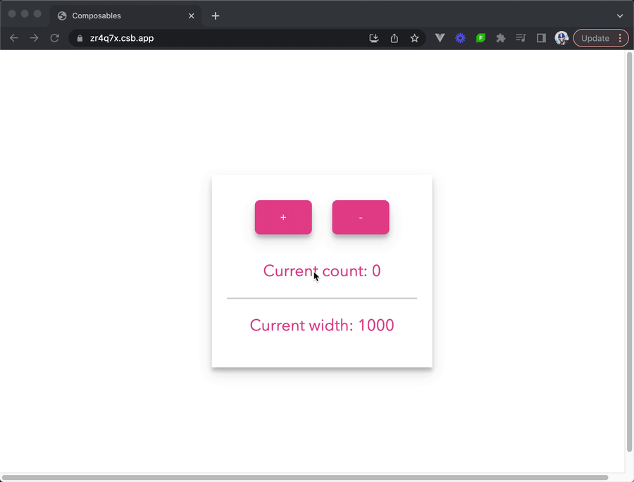
Similarly, the width is automatically updated whenever the window is resized.
The way the App.vue single-file component is structured can be visualized as the following:
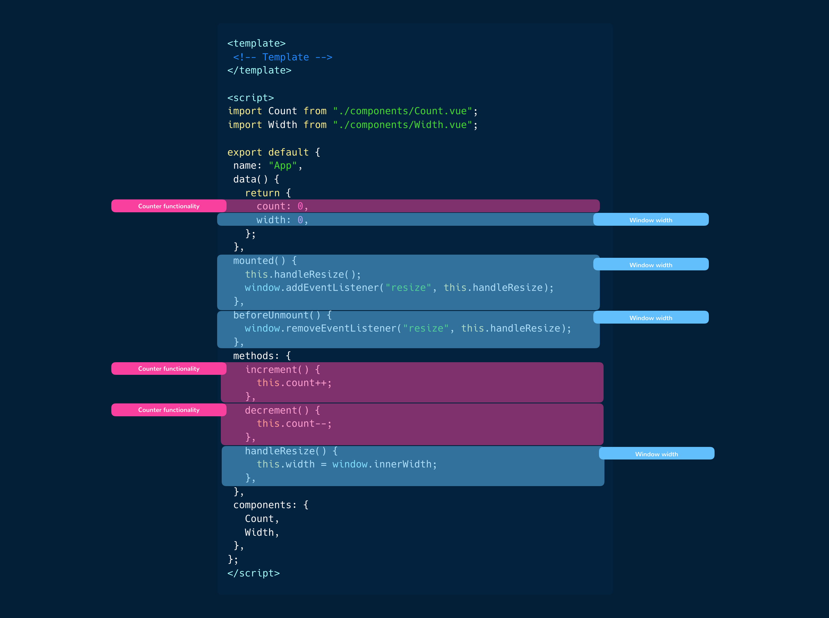
Even though this component is small in size, the logic inside it is already intertwined. Some parts are dedicated to the functionality of the counter, while others pertain to the width logic. As the component grows, organizing and locating related logic within the component would become more challenging.
To address these challenges, the Vue team introduced the Composition API in Vue v3.
Composition API
The Composition API can be seen as an API that provides standalone functions representing Vue’s core capabilities.
These functions are primarily used within a single setup() option which serves as the entry point for utilizing the
Composition API.
<!-- Template -->

<script>
  export default {
    name: "MyComponent",
    setup() {
      // the setup function
    },
  };
</script>

<!-- Styles -->
The setup() function is executed before a component is created and when the props of the component are available.
With the Composition API, we can import standalone functions to help us access Vue’s core capabilities within our component. Let’s rewrite the counter and width example we’ve seen above while relying on the Composition API syntax.
<template>
  <div class="App">
    <Count :count="count" :increment="increment" :decrement="decrement" />
    <div id="divider" />
    <Width :width="width" />
  </div>
</template>

<script>
  import { ref, onMounted, onBeforeUnmount } from "vue";
  import Count from "./components/Count.vue";
  import Width from "./components/Width.vue";

  export default {
    name: "App",
    setup() {
      const count = ref(0);
      const width = ref(0);

      const increment = () => {
        count.value++;
      };

      const decrement = () => {
        count.value--;
      };

      const handleResize = () => {
        width.value = window.innerWidth;
      };

      onMounted(() => {
        handleResize();
        window.addEventListener("resize", handleResize);
      });

      onBeforeUnmount(() => {
        window.removeEventListener("resize", handleResize);
      });

      return {
        count,
        width,
        increment,
        decrement,
      };
    },
    components: {
      Count,
      Width,
    },
  };
</script>
The <template> of our component remains the same but in the <script> section of our component, we now utilize the
Composition API with the setup() function.
Inside the setup() function, we:
- Define the
countandwidthreactive variables using theref()function — the function that accepts a single primitive value (e.g. string, number, etc.) and returns a reactive/mutable object. - We also define the custom functions
increment(),decrement(), andhandleResize(). These functions are similar to the methods we defined in our previous Options API example. - We use the
onMounted()lifecycle function to call the customhandleResize()function and add an event listener for the resize event when the component is mounted. Similarly, we use theonBeforeUnmount()lifecyle function to remove the event listener for the resize event before the component is unmounted. - The reactive variables and functions defined in the
setup()function are then returned, making them accessible in the component template.
1<template>2 <div class="App">3 <Count :count="count" :increment="increment" :decrement="decrement" />4 <div id="divider" />5 <Width :width="width" />6 </div>7</template>89<script>10import { ref, onMounted, onBeforeUnmount } from "vue";11import Count from "./components/Count.vue";12import Width from "./components/Width.vue";1314export default {15 name: "App",16 setup() {17 const count = ref(0);18 const width = ref(0);1920 const increment = () => {21 count.value++;22 };2324 const decrement = () => {25 count.value--;26 };2728 const handleResize = () => {29 width.value = window.innerWidth;30 };3132 onMounted(() => {33 handleResize();34 window.addEventListener("resize", handleResize);35 });3637 onBeforeUnmount(() => {38 window.removeEventListener("resize", handleResize);39 });4041 return {42 count,43 width,44 increment,45 decrement,46 };47 },48 components: {49 Count,50 Width,51 },52};53</script>
Composables
With our previous code example, one might still wonder how the setup() function offers any advantage to development
since it appears that it just requires us to declare component options within a single function.
One of the fantastic benefits of adopting the composition API is the capability to extract and reuse shared logic between components. This is driven by the fact that we can simply declare functions of our own that use Vue’s globally available composition functions and have our functions be easily used in multiple components to achieve the same outcome.
Let’s take our previous counter and width example further by creating composable functions that encapsulates shared logic that can be reused across components.
First, let’s create a composable function called useCounter, a composable that encapsulates the counter functionality and
returns the current value of count, an increment() method, and a decrement() method.
By convention, composable function names start with the “use” keyword.
import { ref } from "vue";

export function useCounter(initialCount = 0) {
  const count = ref(initialCount);

  function increment() {
    count.value++;
  }

  function decrement() {
    count.value--;
  }

  return {
    count,
    increment,
    decrement,
  };
}
Similarly, we can create a composable called useWidth() that encapsulates the width functionality of our app.
import { ref, onMounted, onBeforeUnmount } from "vue";

export function useWidth() {
  const width = ref(0);

  function handleResize() {
    width.value = window.innerWidth;
  }

  onMounted(() => {
    handleResize();
    window.addEventListener("resize", handleResize);
  });

  onBeforeUnmount(() => {
    window.removeEventListener("resize", handleResize);
  });

  return {
    width,
  };
}
In our App component, we can now use the composable functions to achieve the same outcome:
<template>
  <div class="App">
    <Count :count="count" :increment="increment" :decrement="decrement" />
    <div id="divider" />
    <Width :width="width" />
  </div>
</template>

<script>
  import Count from "./components/Count.vue";
  import Width from "./components/Width.vue";
  import { useCounter } from "./composables/useCounter";
  import { useWidth } from "./composables/useWidth";

  export default {
    name: "App",
    components: {
      Count,
      Width,
    },
    setup() {
      const { count, increment, decrement } = useCounter(0);
      const { width } = useWidth();

      return {
        count,
        increment,
        decrement,
        width,
      };
    },
  };
</script>
With these changes, our app will function the same as it did before but in a more composable setting.
1<template>2 <div class="App">3 <Count :count="count" :increment="increment" :decrement="decrement" />4 <div id="divider" />5 <Width :width="width" />6 </div>7</template>89<script>10import Count from "./components/Count.vue";11import Width from "./components/Width.vue";12import { useCounter } from "./composables/useCounter";13import { useWidth } from "./composables/useWidth";1415export default {16 name: "App",17 components: {18 Count,19 Width,20 },21 setup() {22 const { count, increment, decrement } = useCounter(0);23 const { width } = useWidth();2425 return {26 count,27 increment,28 decrement,29 width,30 };31 },32};33</script>
By using composable functions in the Composition API setting, we were able to break the context of our app down into smaller, reusable pieces that separated the logic.
Let’s visualize the changes we just made, compared to the initial Options API example component.
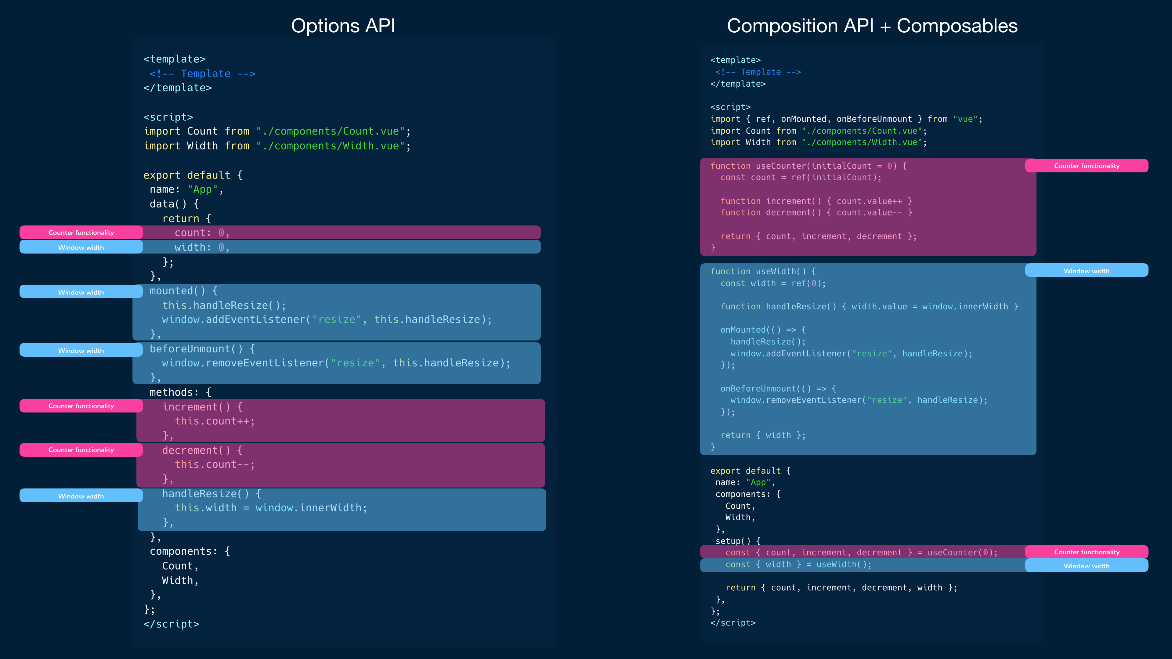
Using composable functions in Vue made it easier to separate the logic of our component into several smaller pieces. Reusing the same stateful logic now becomes easy since we are no longer confined to organizing our code within specific options in the Options API.
With composable functions, we have the flexibility to extract and reuse shared logic across components. This separation of concerns allows us to focus on specific functionality within each composable function making our code more modular and maintainable.
By breaking down the logic into smaller, reusable pieces, we can compose our components using these composable functions, bringing together the necessary functionality without duplicating code. This approach promotes code reusability and reduces the risk of code duplication and inconsistencies.
Additionally, using the Composition API provides better readability and understandability of the component’s logic. Each composable function encapsulates a specific aspect of the component’s behavior, making it easier to reason about and test. It also allows for easier collaboration among team members, as the code becomes more structured and organized.
Lastly, building Vue apps with the Composition API allows for better type inference. Since the Composition API helps us handle our component logic with variables and standard JavaScript functions, it becomes a lot easier to build large-scale Vue applications with a static type system like TypeScript!